


Colour Theory in Office Furniture Design
Why is Colour Important?
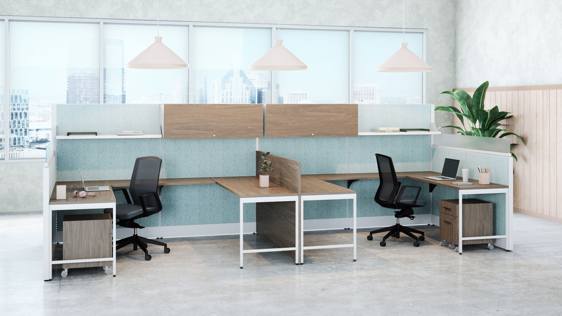
Colour is a powerful communication tool that influences our behaviors, moods, and perceptions, so when thinking about office furniture design, the colour theory shouldn’t be taken lightly. Studies show that colours have substantial psychological effects on your employees and clients, impacting creativity, productivity, and communication.
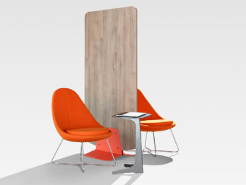
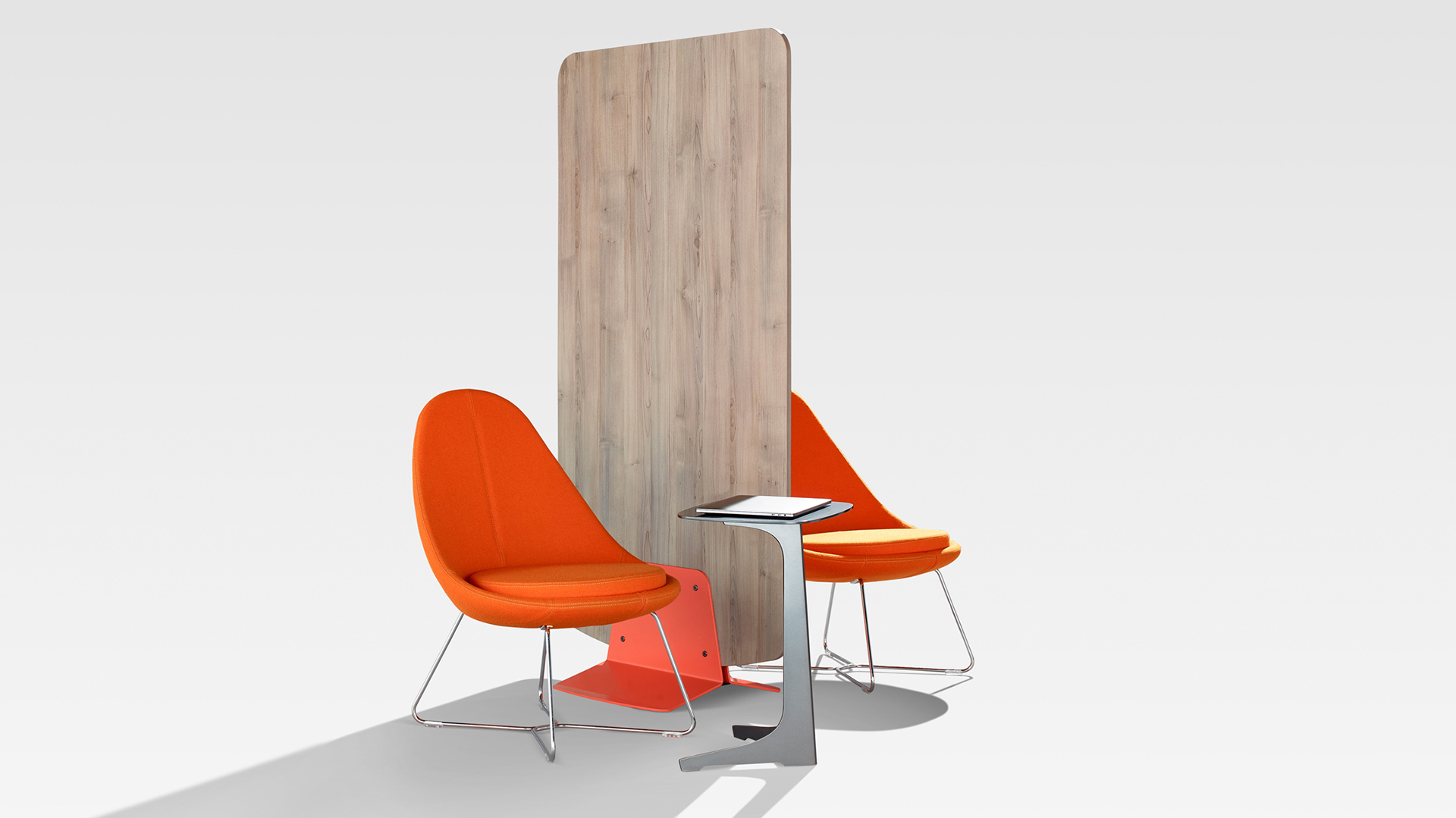
For example, if you want to create a sense of energy and movement through your project, choosing a bright red or yellow might be the right choice. On the other hand, if you want to create a sense of calmness and tranquility, purple might better suit your project.
If you are thinking about refreshing the colours of your office while promoting harmony and creativity, then check out this quick guide to help you choose colours based on colour theory.
Understanding Colour Schemes
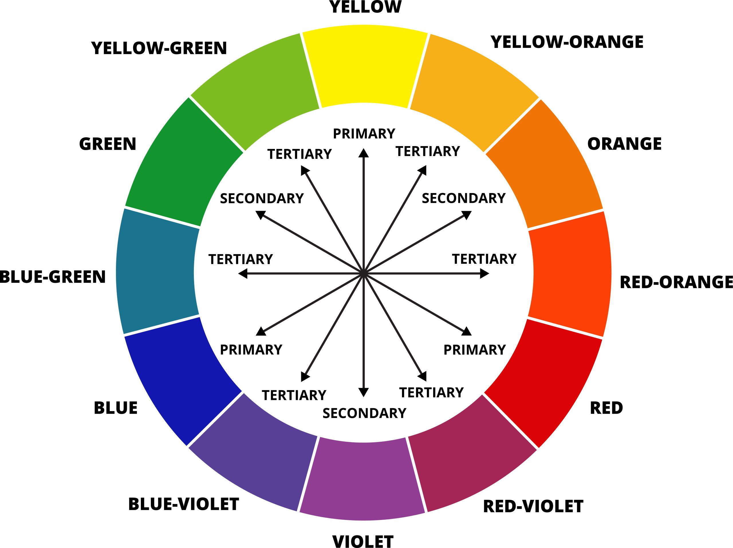
Colour schemes can be used as an effective way to convey meaning and emotion to your space. They consist of a combination of colours used in various design disciplines, including architecture, product design and interior design. Each colour scheme consists of one or more of the twelve colours present on the colour wheel.
The standard colour wheel is divided into three colours: red, yellow, and blue. These are known as primary colours and cannot be created by mixing two or more other colours together. The wheel is then further broken down to include secondary colours such as orange, green, and purple, which are created through a combination of the primary colours. Additionally, the secondary colours are mixed together to form tertiary colours such as red-orange and blue-green.
When it comes to colour palettes, there are a vast array of options to choose from which can be overwhelming and time-consuming. Fortunately, we have a few tried-and-true colour schemes to make choosing colours easier and guarantee a harmonious palette for your project.
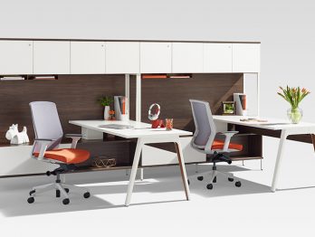
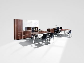
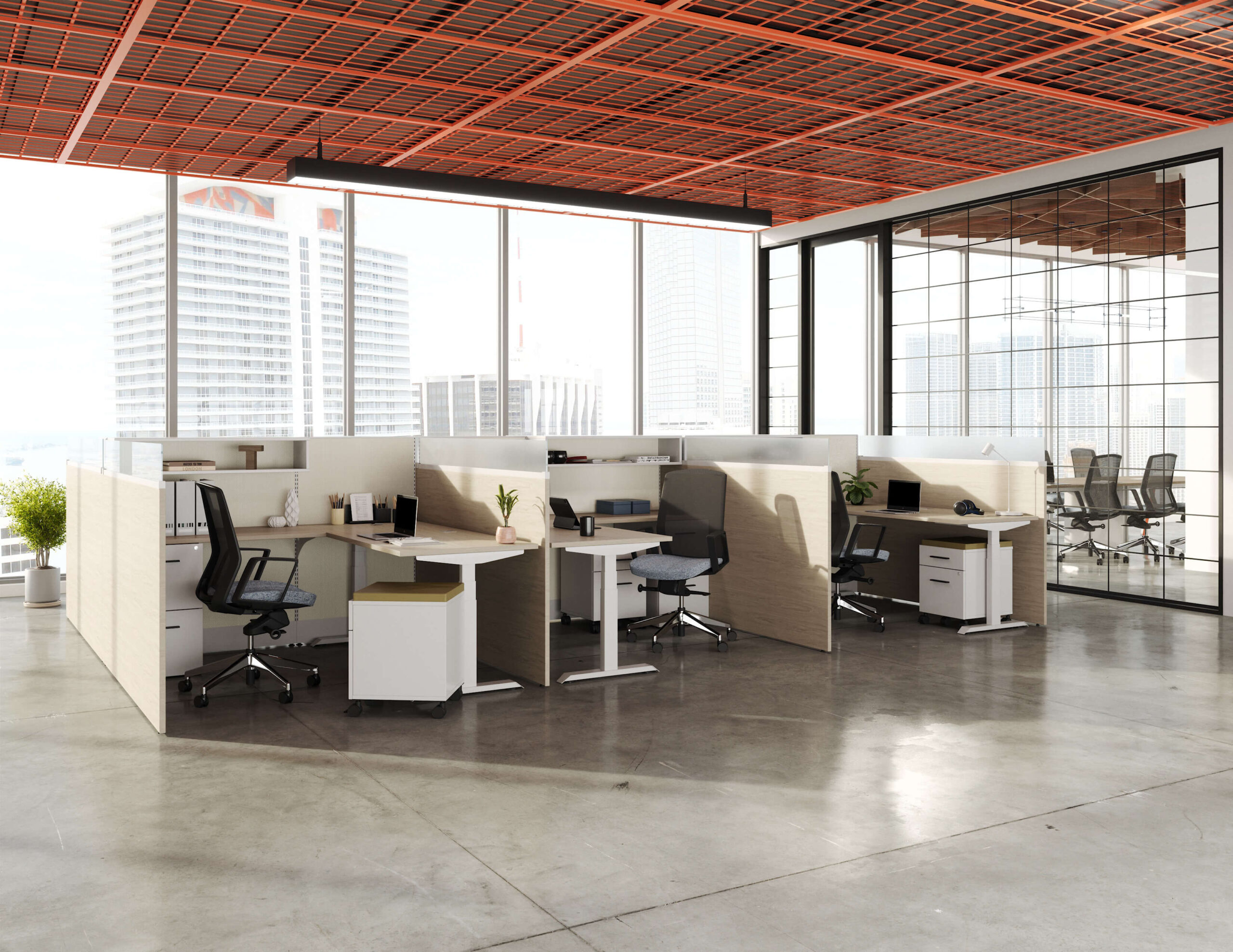
For the purpose of this article, we have chosen to focus on the three most popular office colour schemes: Complementary, Monochromatic and Analogous. Each one has unique characteristics, and combining them with neutral colours (black, white, grey and brown), make them perfect for different purposes. Here’s what makes each one special:
Complementary Colour Scheme
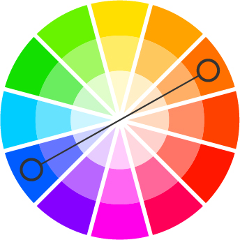
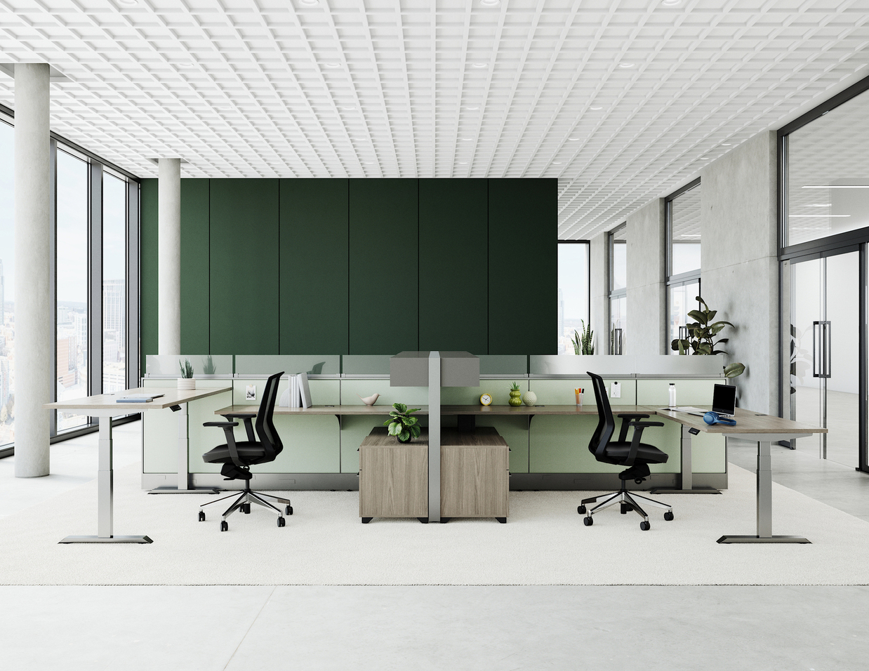
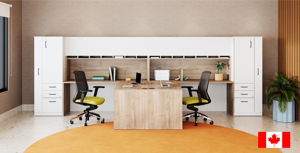
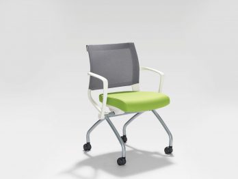
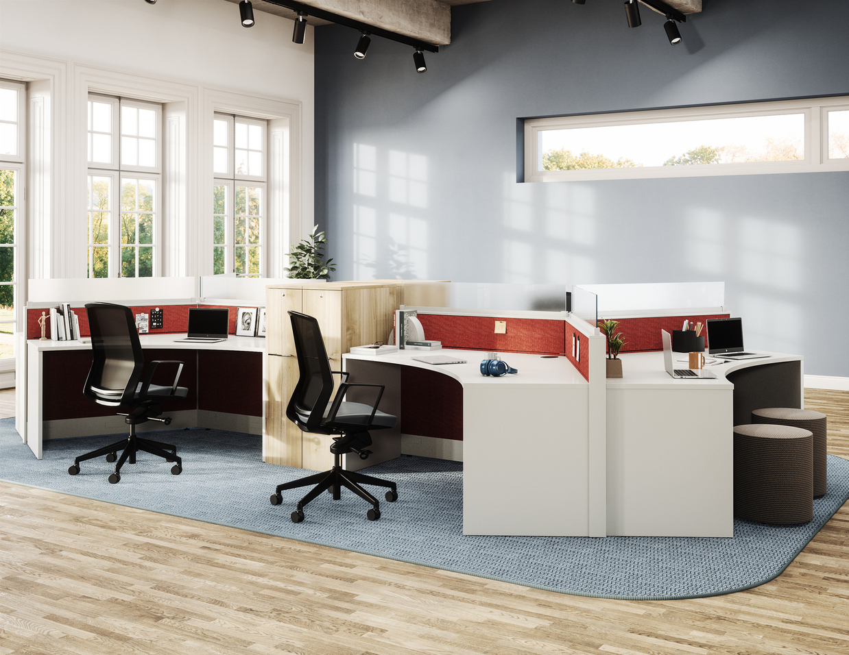
A complementary palette uses two hues opposite each other on the colour wheel, for example, red and green. They work well because they generate high contrast, making it easy to see both colours clearly.
Complementary colours are great when you want something to stand out from its surroundings however, they should be used sparingly as they can be overwhelming if used too heavily. We suggest that when using complementary colours you should use one hue as your main colour and use the complementary colour to highlight some items in the space.
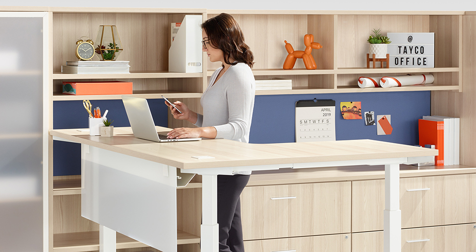
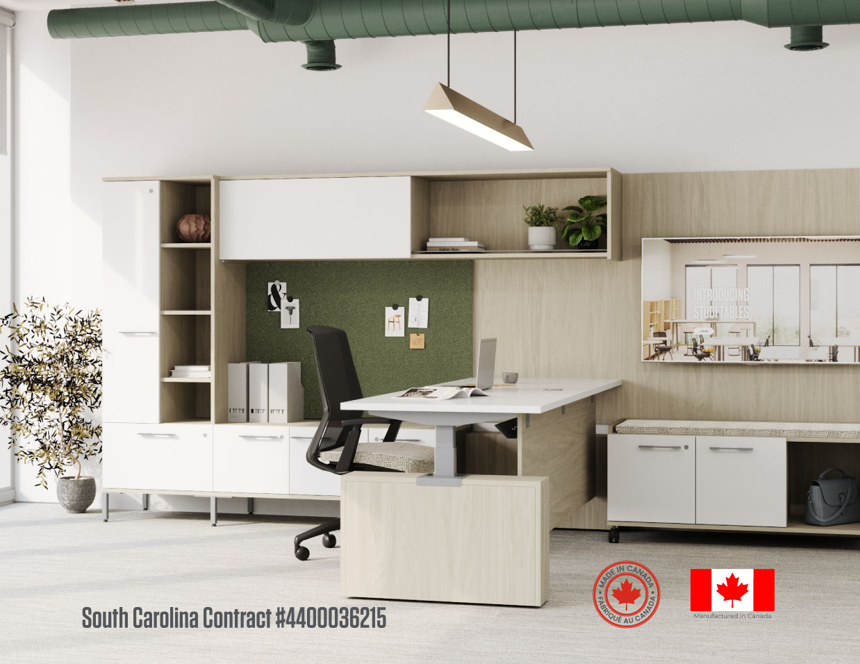
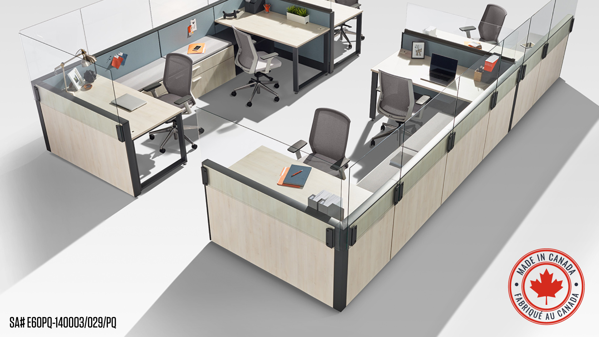
Monochromatic Colour Scheme
Monochromatic schemes use only one hue variation of one colour; this can be achieved by using different values of one hue (light or dark) or by using different tones of one hue together at once (such as light tone mixed with dark tone). There are no additional hues in a monochromatic colour scheme.
Monochromatic colour schemes are ideal for creating a balance between two different types of objects, and they are a great choice if you are looking for a simple and subtle look that’s easy on the eyes.
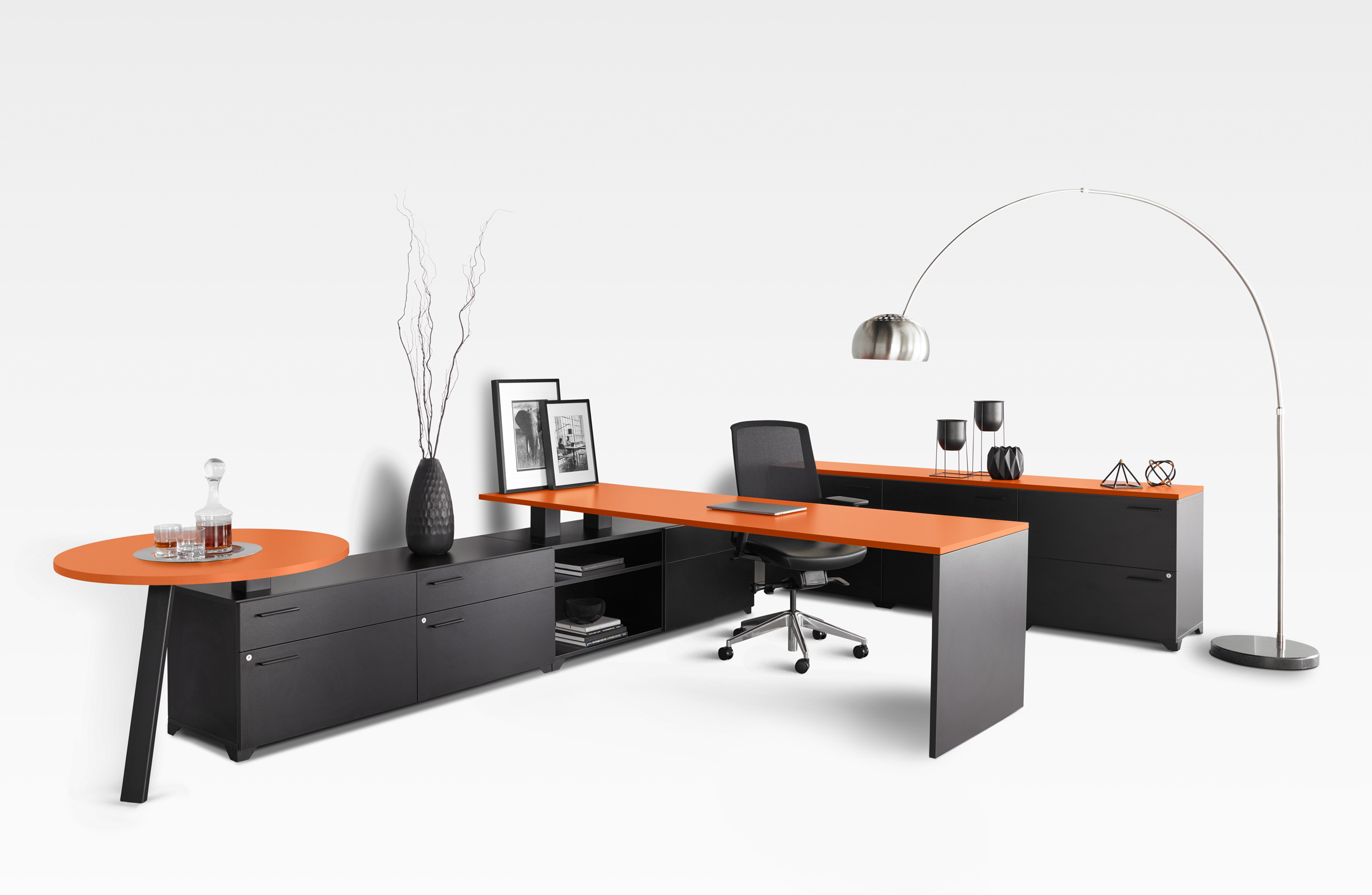
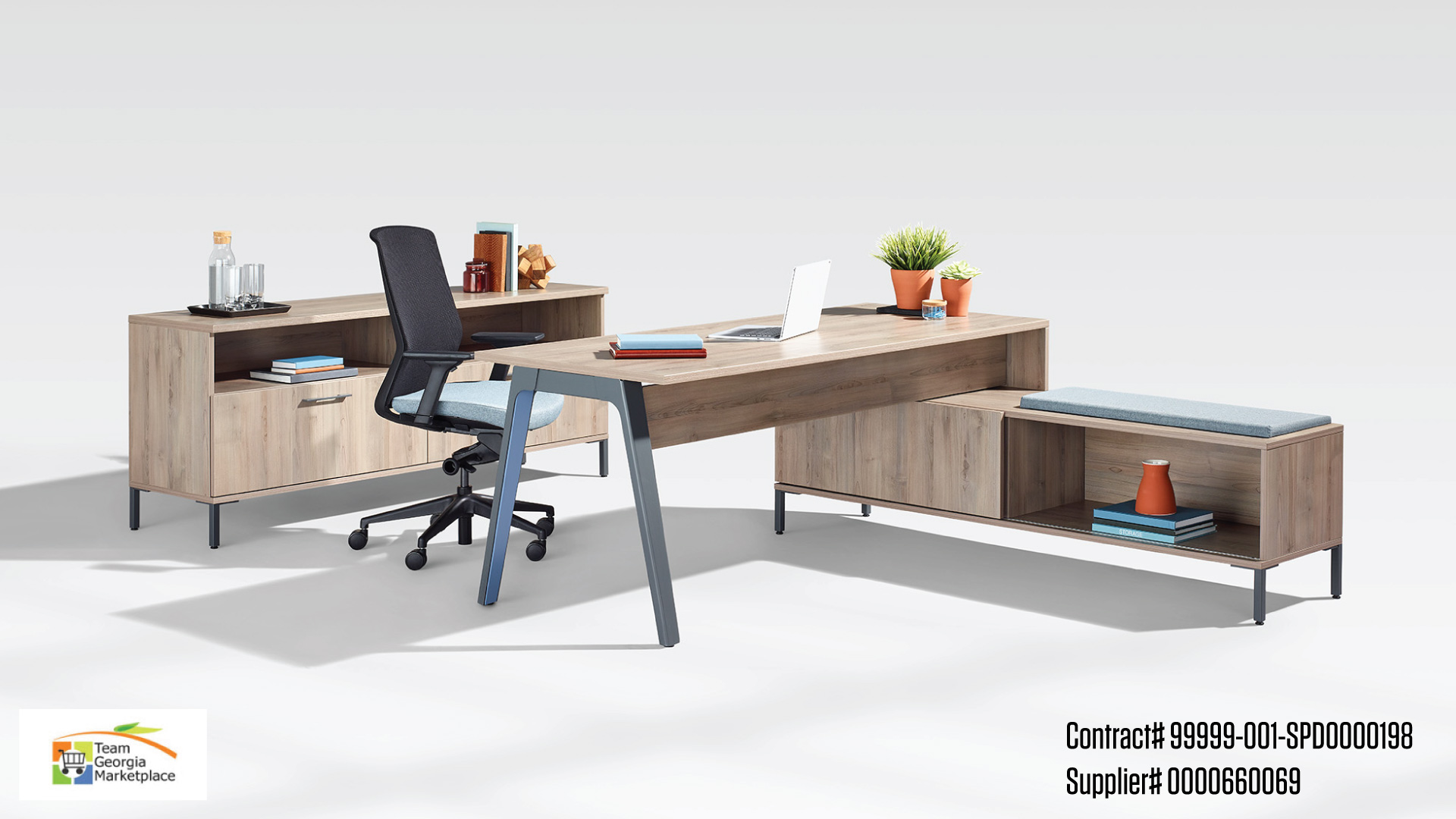
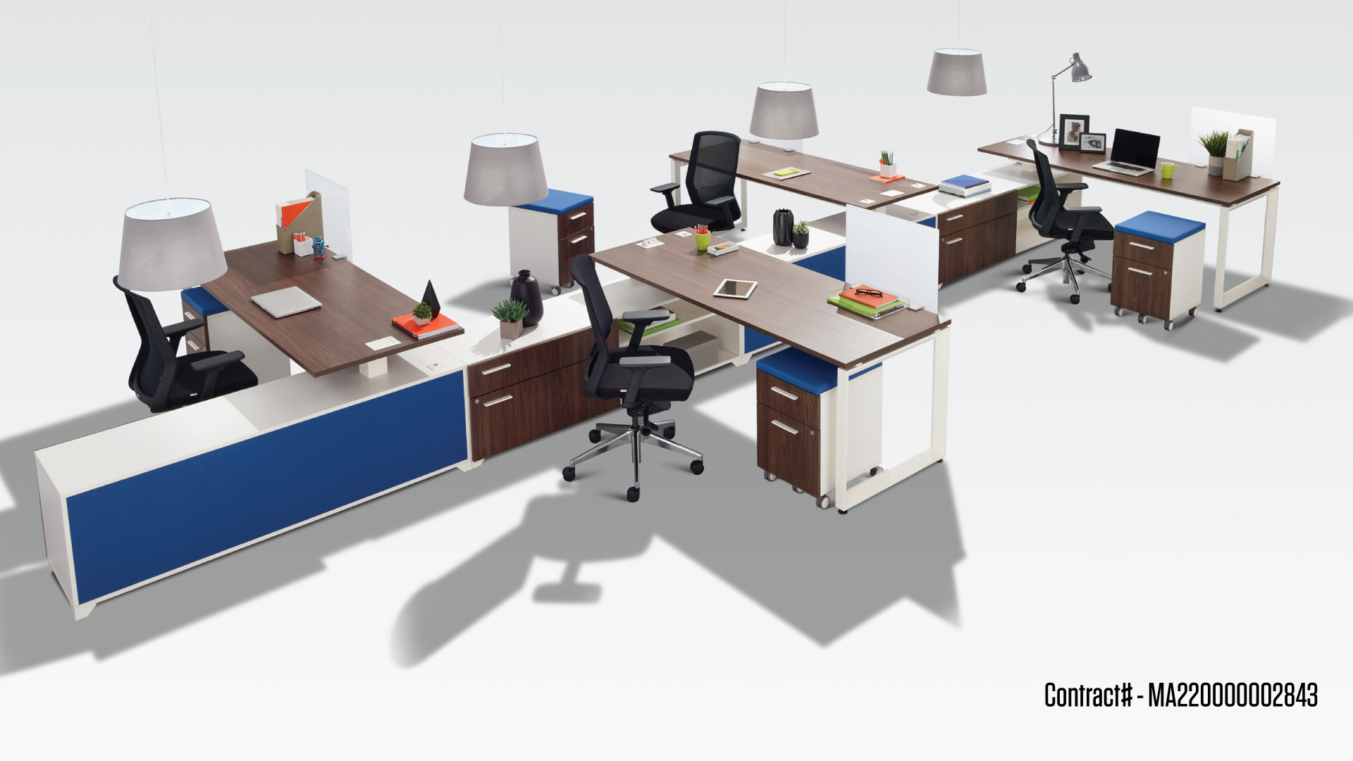
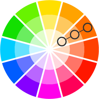
Analogous Colour Scheme
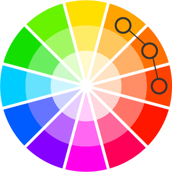
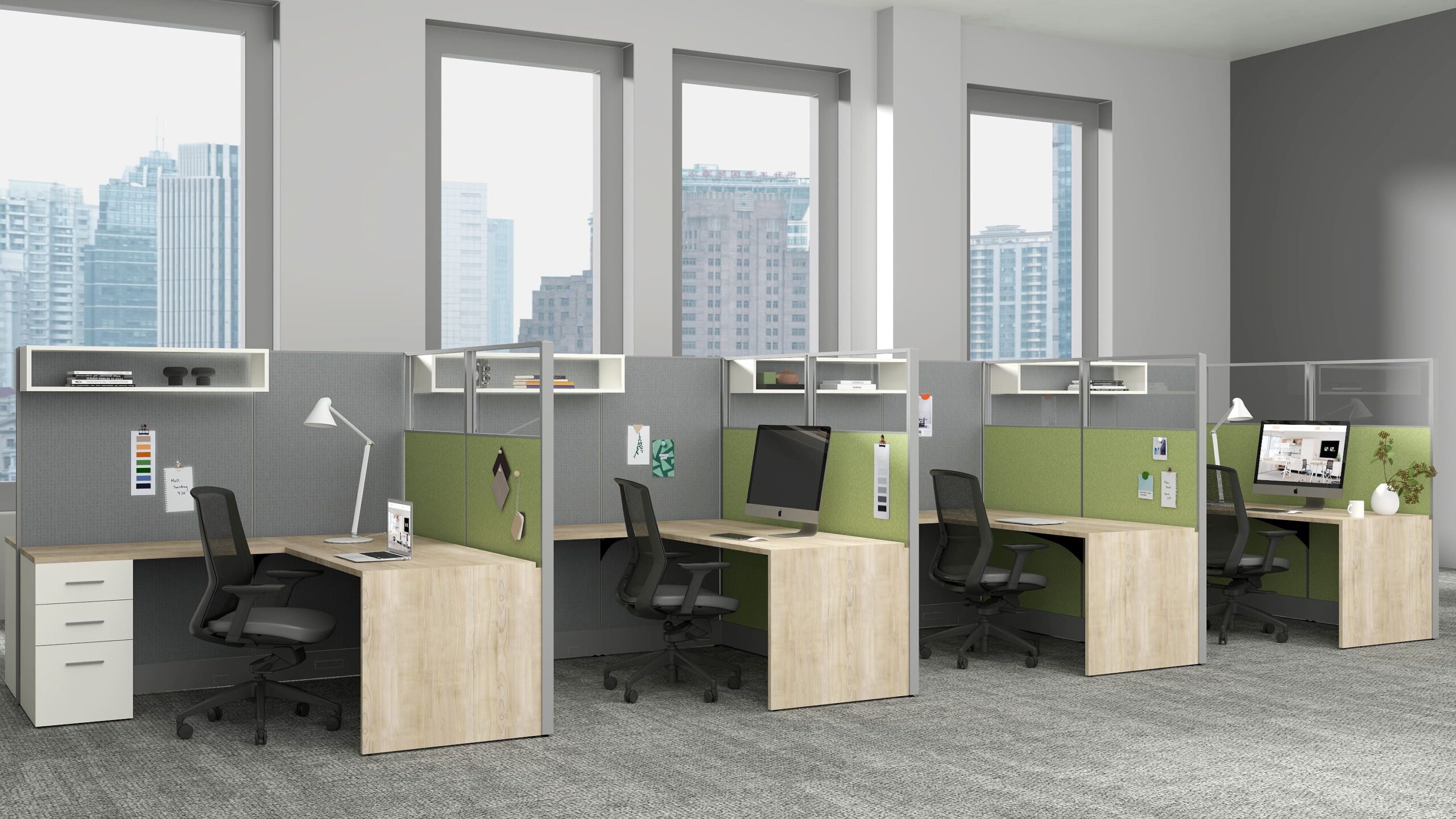
Analogous colours are next-door neighbors on the colour wheel, composed of shades of similar hues. There is often one dominant colour (a primary or secondary colour), a supporting colour (a secondary or tertiary colour), and a third colour (an accent colour that pops or a mix of the two first colours). Analogous colour schemes involve closely related hues of one colour that easily harmonize with each other.
Many designers apply the 60-30-10 rule to create a visually appealing balance. This rule suggests that 60% of your space will be dominant colour, 30% supporting colour, and 10% will be the accent colour. Analogous colours work great together because they share similar lightness/darkness values.

There are thousands of colour combinations out there that you can try to add personality to your workspace and to make it aesthetically pleasant. Now that you know the basic colour schemes, it will be easier to create an inviting and pleasant environment within your office space.
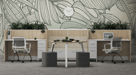
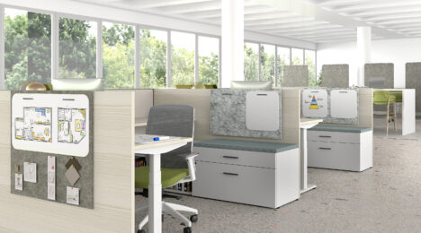
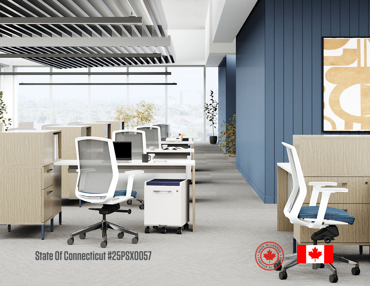
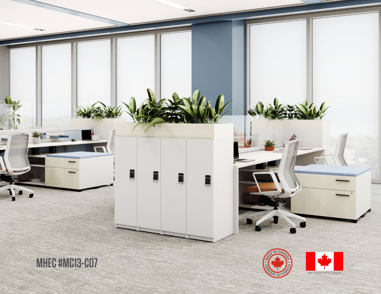
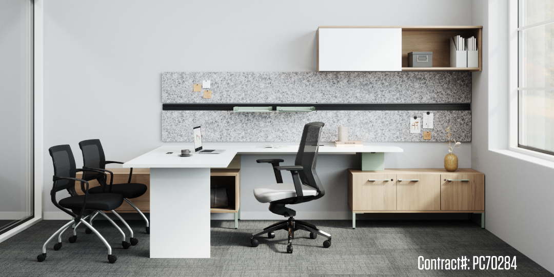
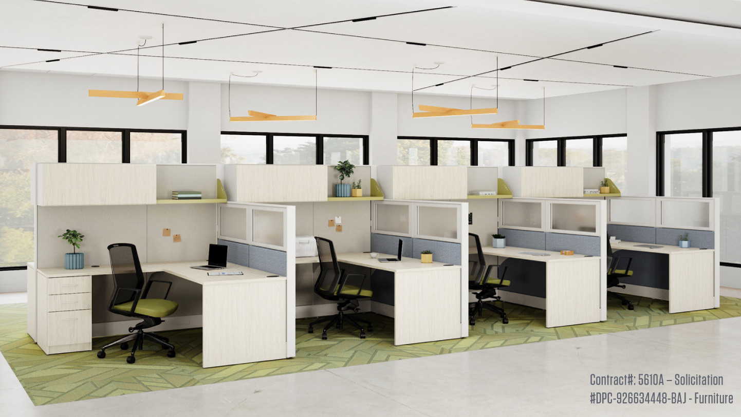
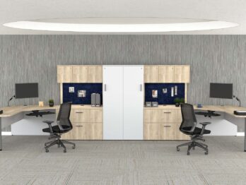
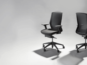
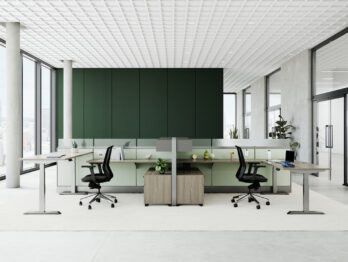
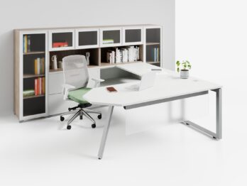
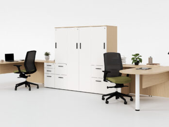
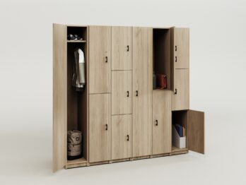
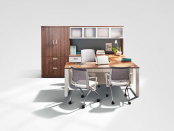
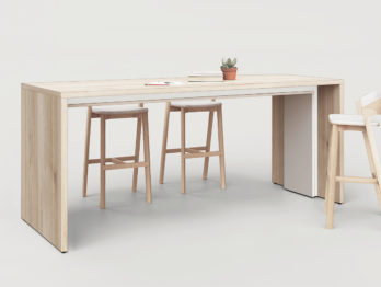
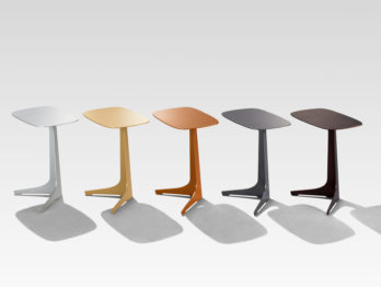
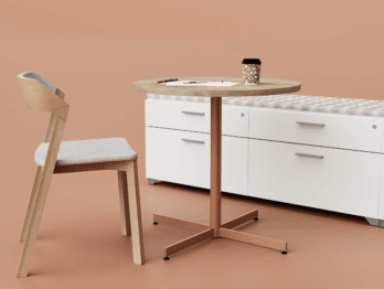
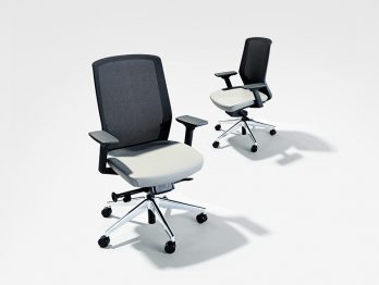
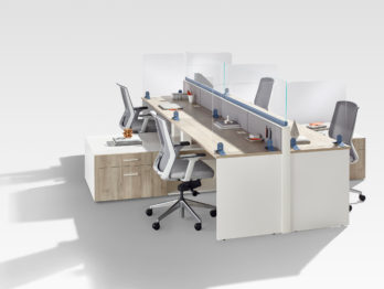
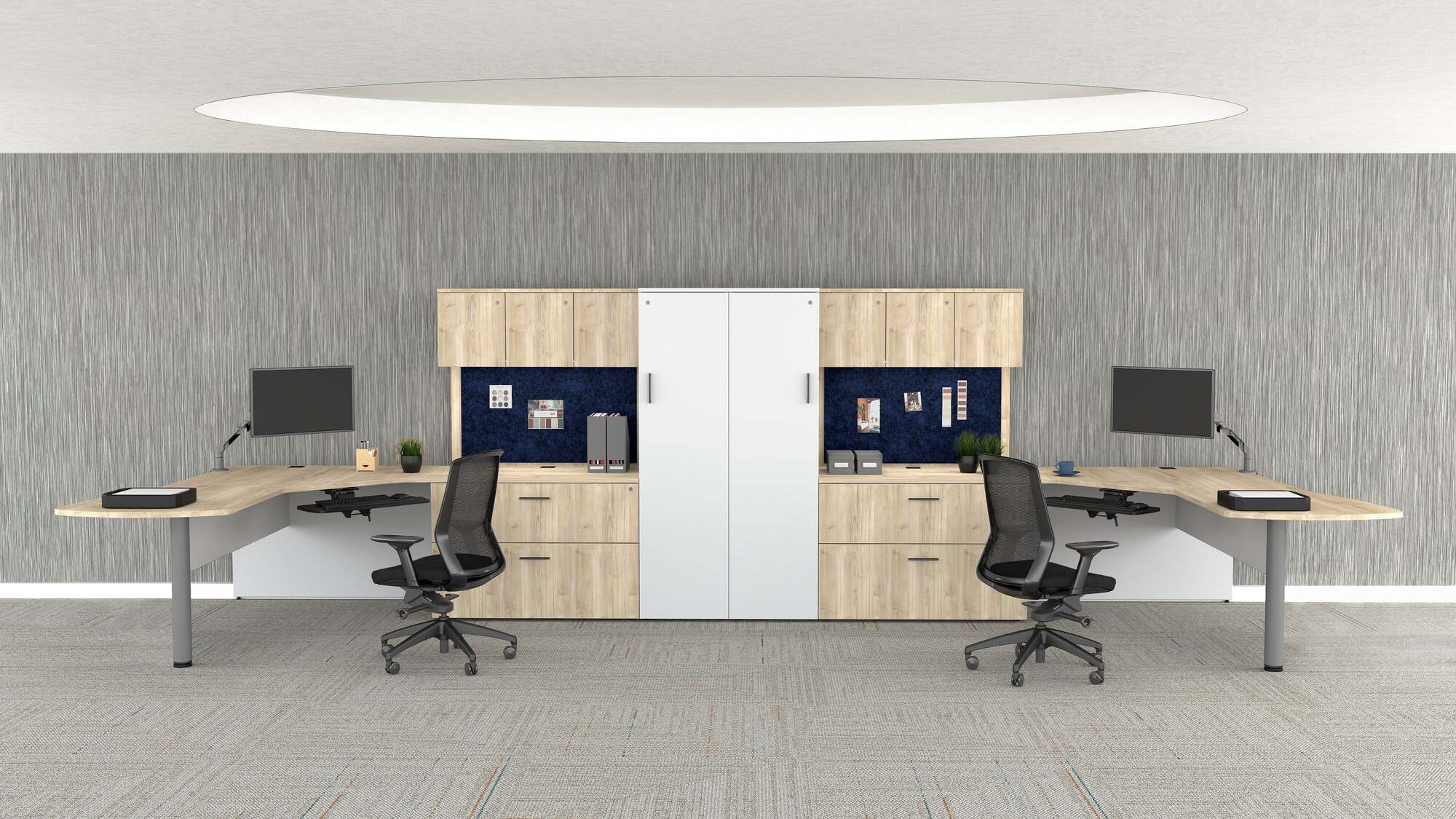
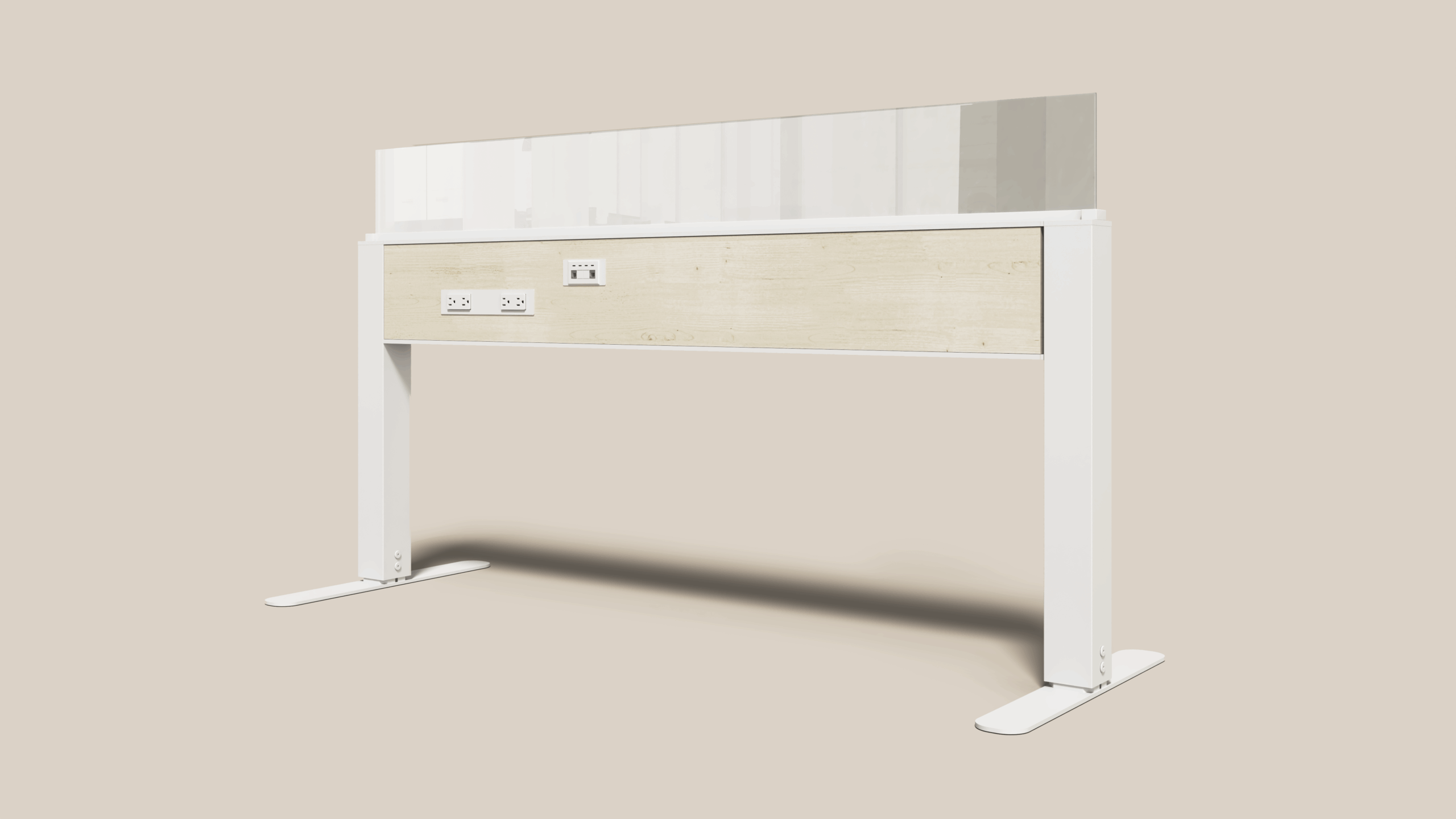
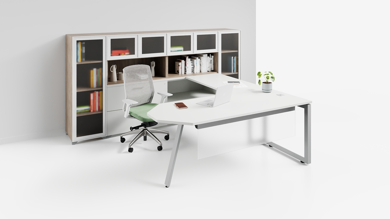
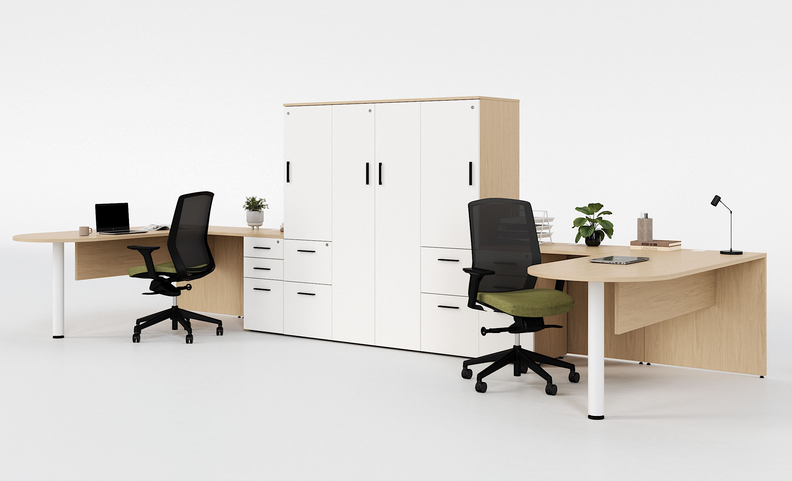
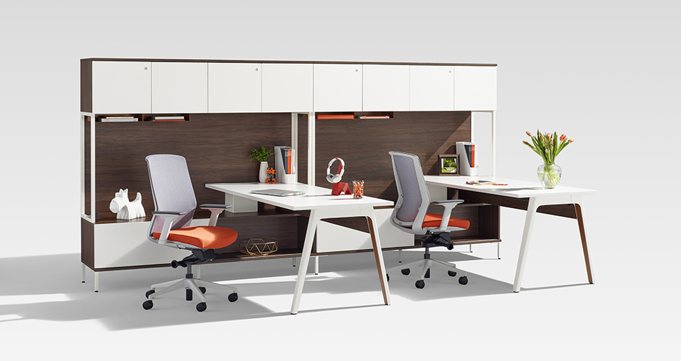
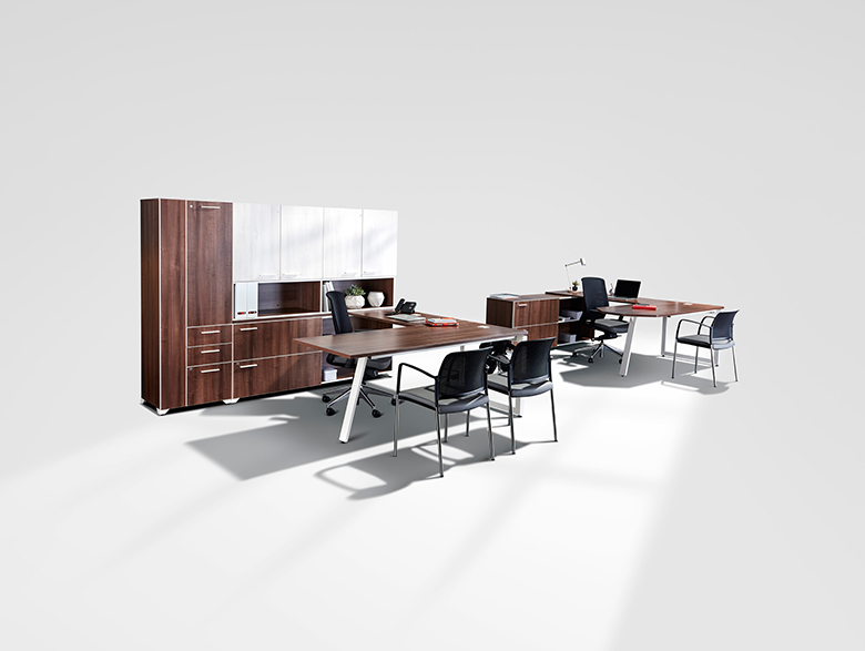
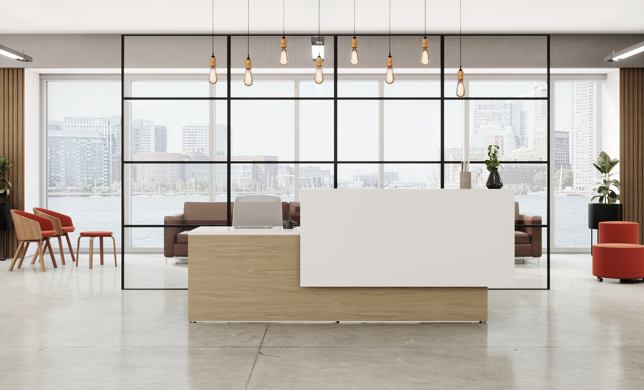
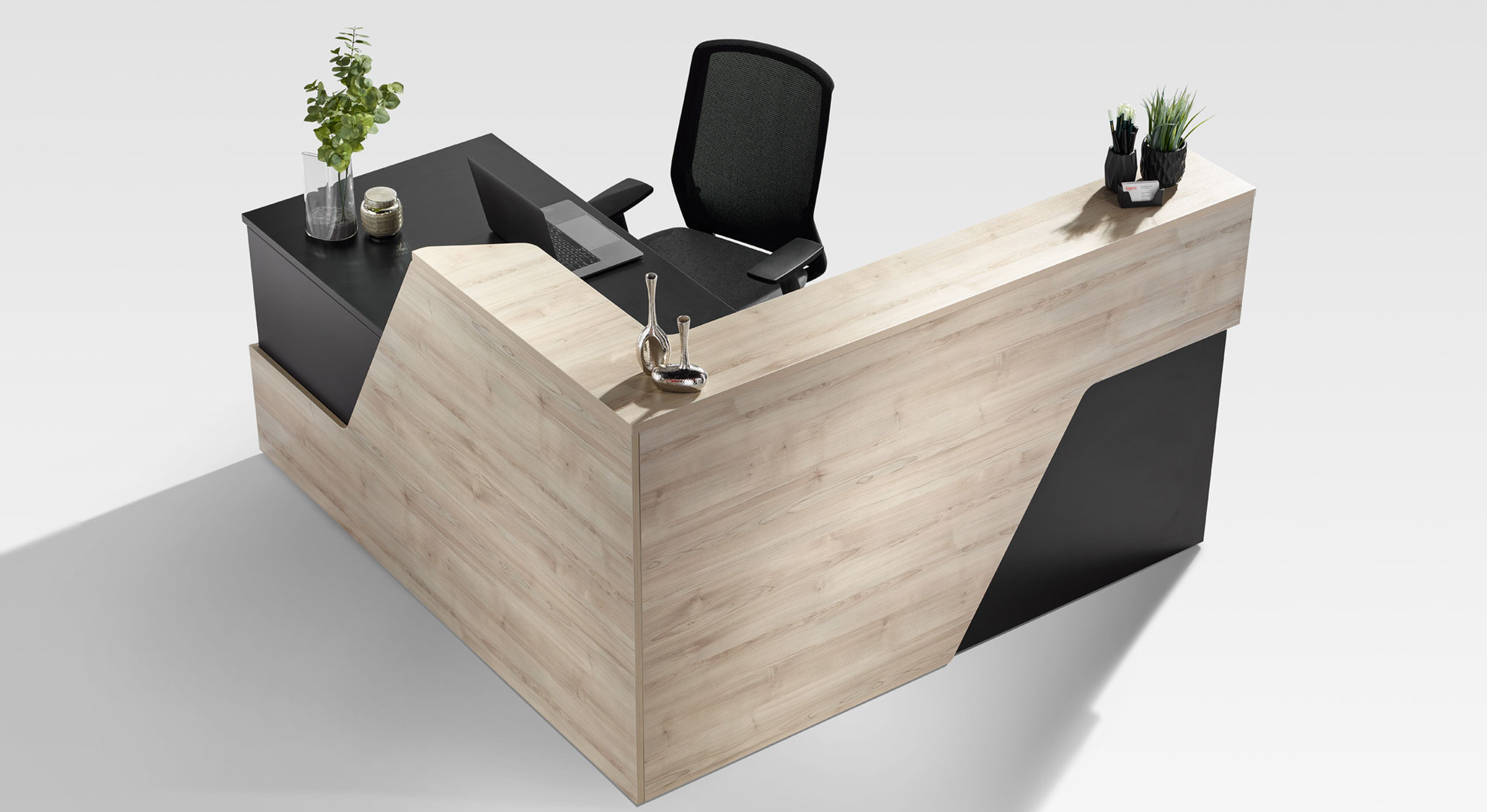
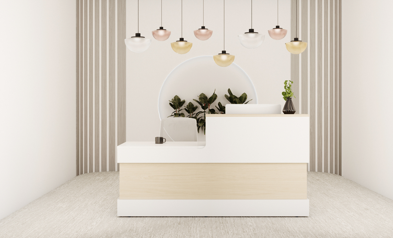
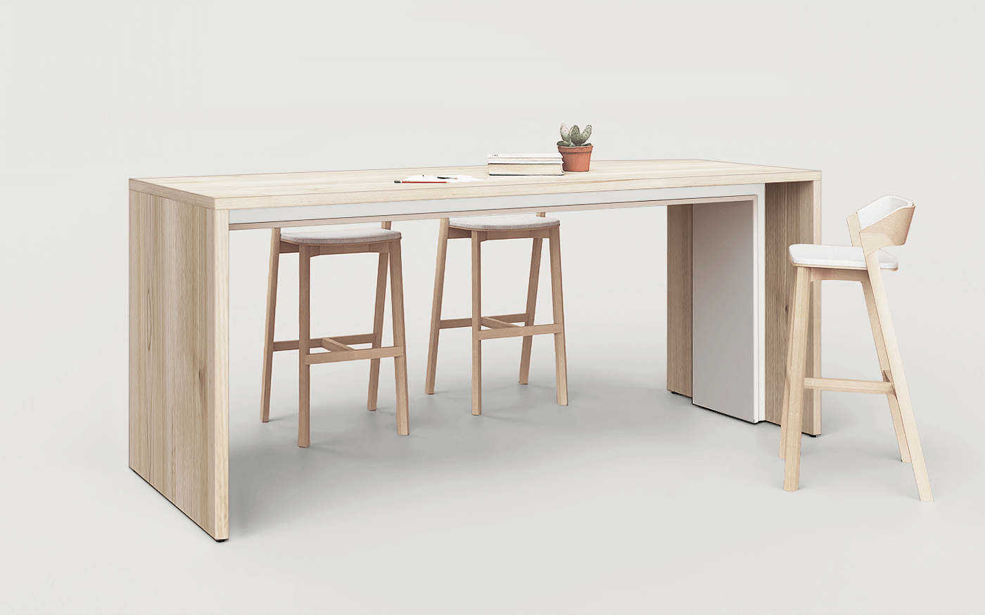
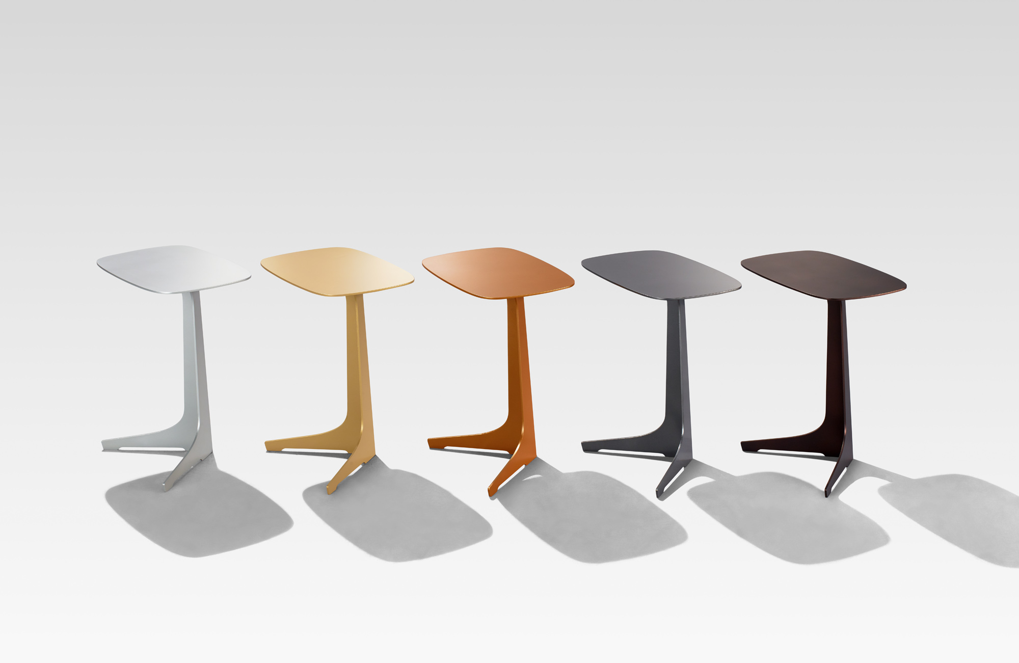
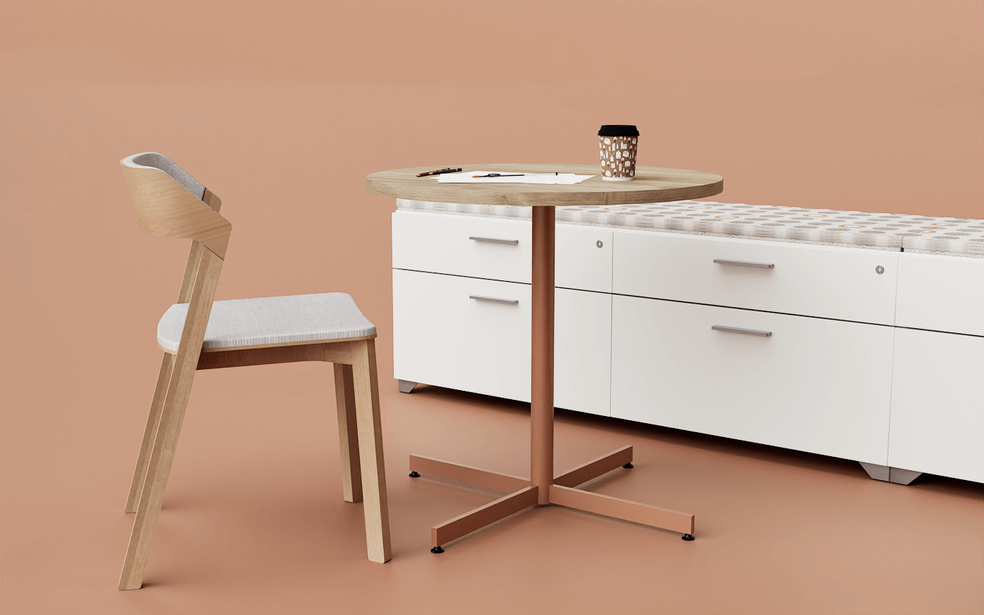
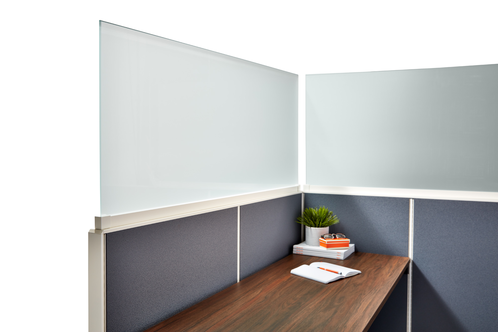
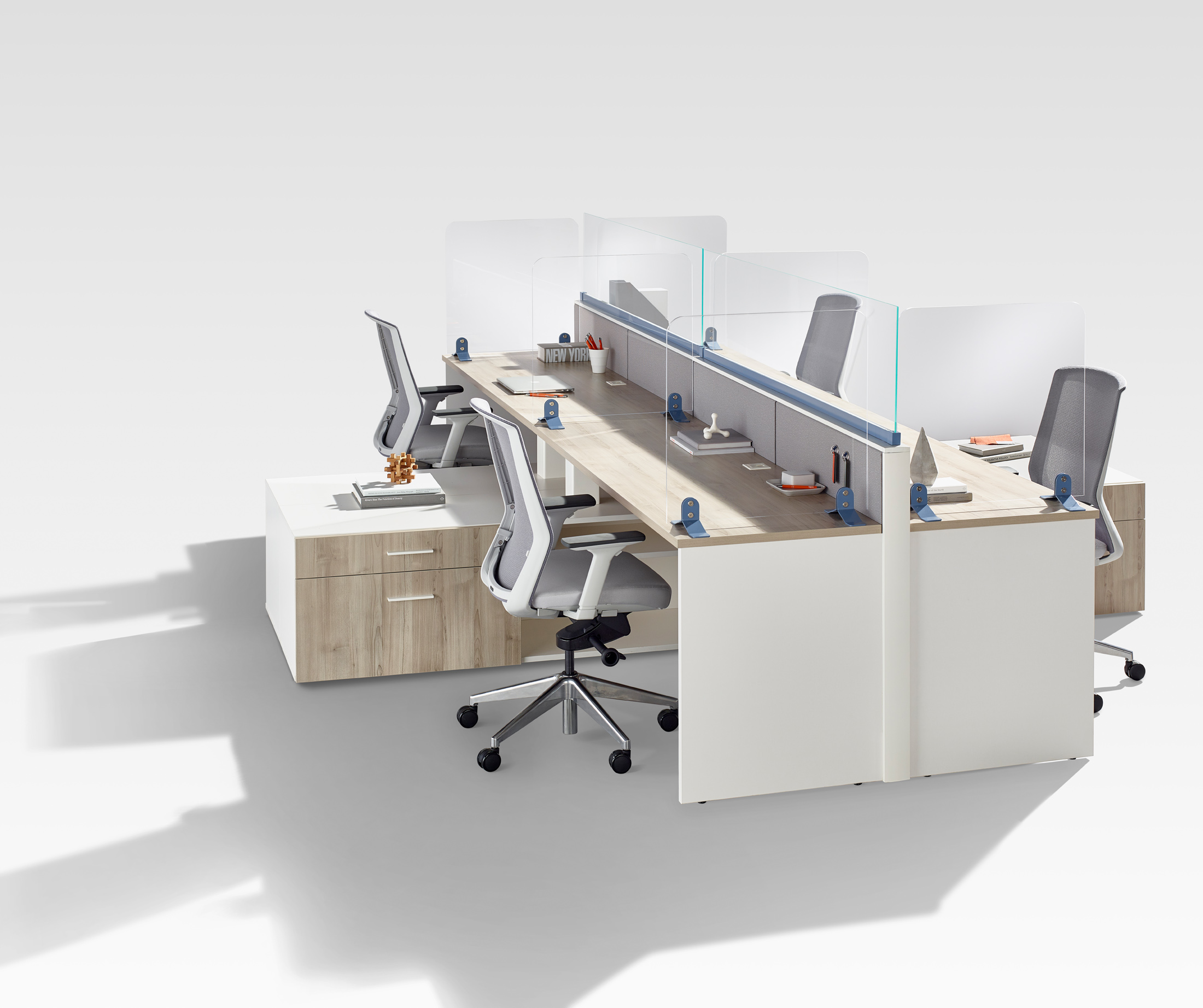
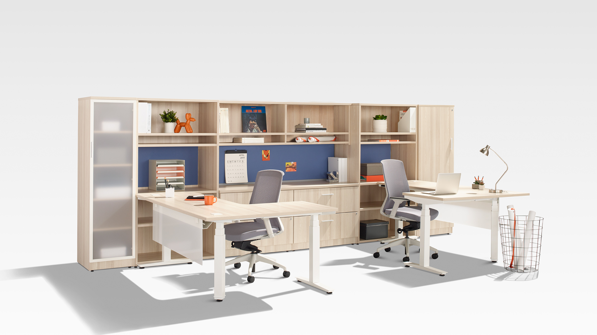
At Tayco, we offer an abundance of color options for our metal finishes, fabrics, and laminates that you can be sure you’ll find the perfect scheme for your office space. Our team of experts is ready to help you find the perfect color combination to create the work environment you always dream of.
If you need some colour inspiration for your office design, download our Office Colour Schemes Inspiration Guide below: